Time series analysis helps us understand trends and predict future values in areas like finance, weather, and sales. Using R, a key tool for statistics, we can visualize this data for better understanding. This post will introduce basic visualization techniques for time series data in R.
Before anything, make sure to install and load forecast:
install.packages('forecast', dependencies = TRUE)
library(forecast)
The first step in any time series analysis is to simply visualize the raw data. In R, the plot() function serves this purpose:
plot(AirPassengers, xlab="Time", ylab="Number of Passengers",
  main="Monthly Airline Passengers Data")
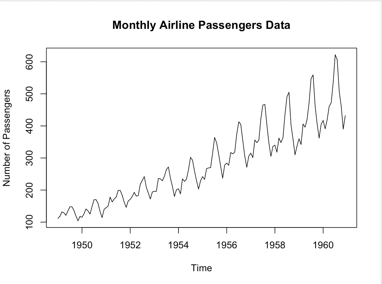
This basic visualization gives us an understanding of the general trends and patterns.
Once we have our basic plot, we can break our time series down into its core components: trend, seasonality, and residuals.
decomposition <- decompose(AirPassengers)
plot(decomposition)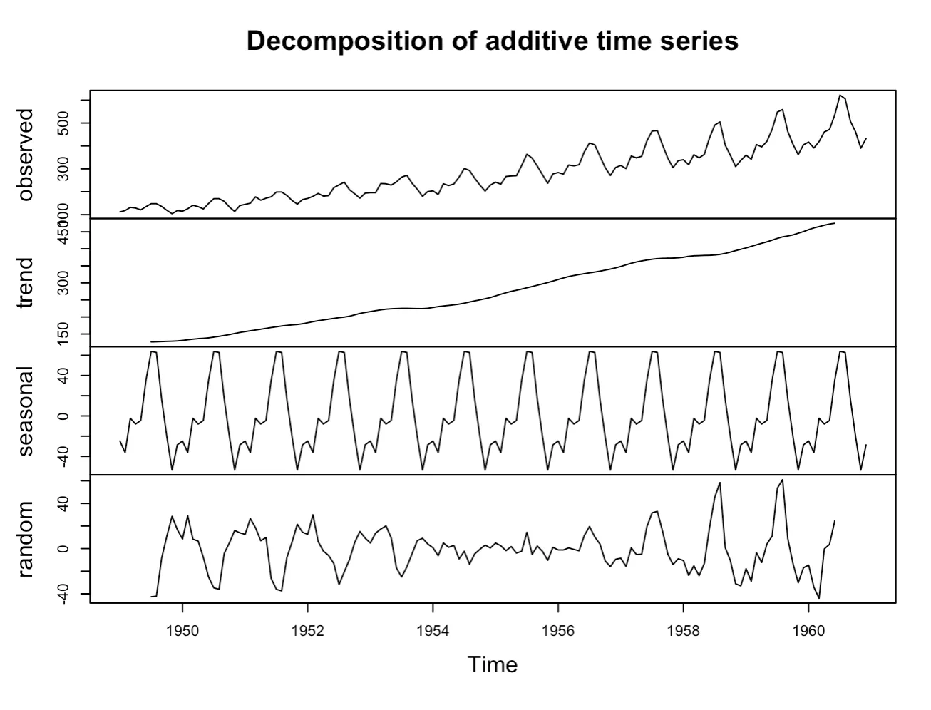
This decomposition allows us to see the underlying trend, any seasonality component, and the residuals (or noise) separately.
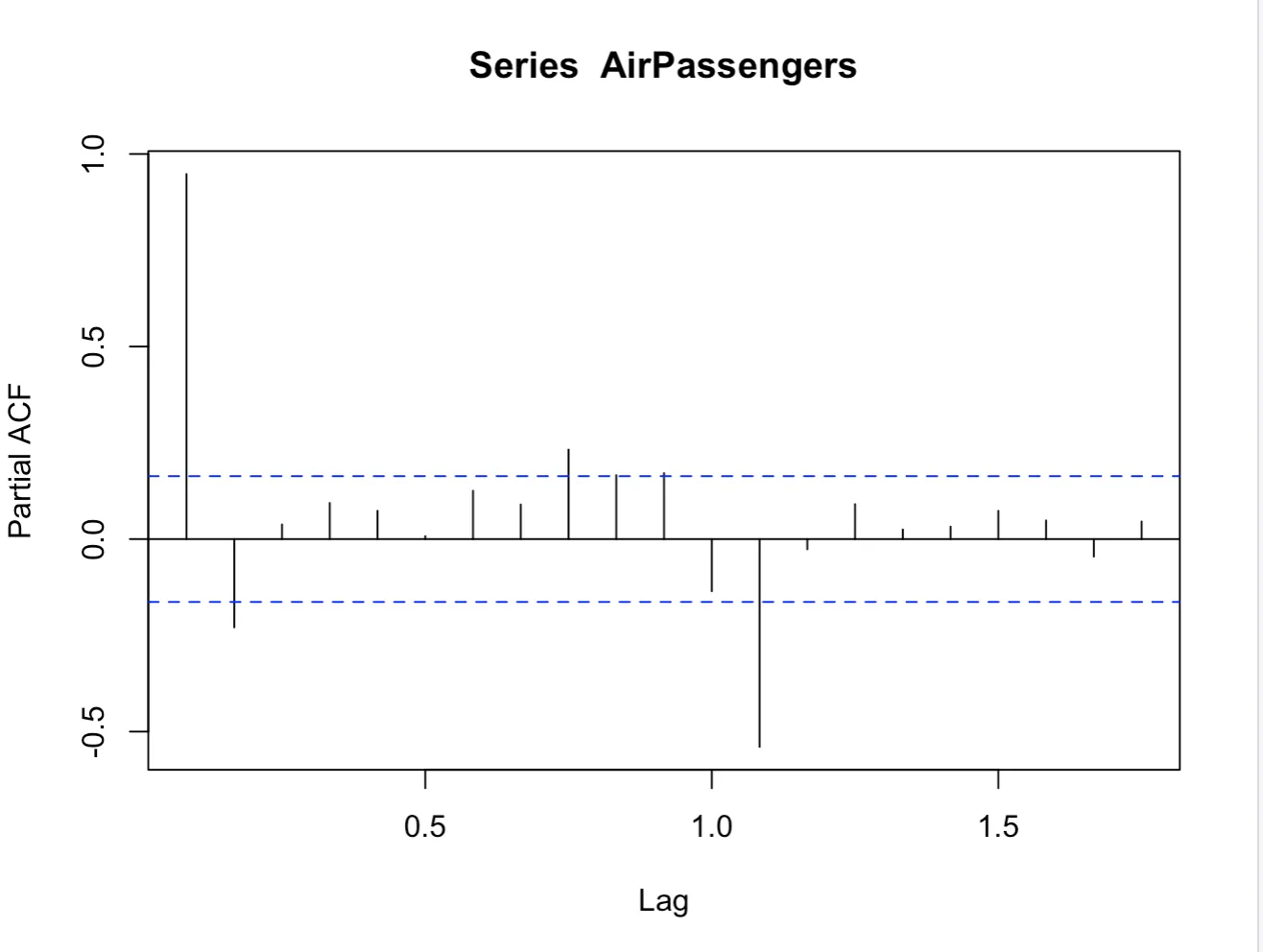
The Auto-correlation function (ACF) and the partial auto-correlation function (PACF) are tools to measure and visualize the correlation in time series data:
acf(AirPassengers)
pacf(AirPassengers)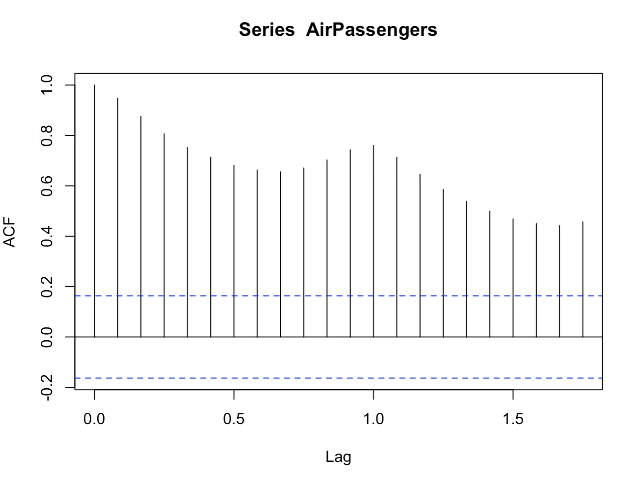
After fitting a model, such as ARIMA, it’s important to visualize the residuals to understand the model’s fit:
fit <- auto.arima(AirPassengers)
# Setting up the plotting window to 2x1 for the first two plots
par(mfrow=c(1,2))

# Plot residuals
plot(fit$residuals, main="Residuals over Time")

# ACF of residuals
acf(fit$residuals, main="ACF of Residuals")

# Reset graphical parameters to default
par(mfrow=c(1,1))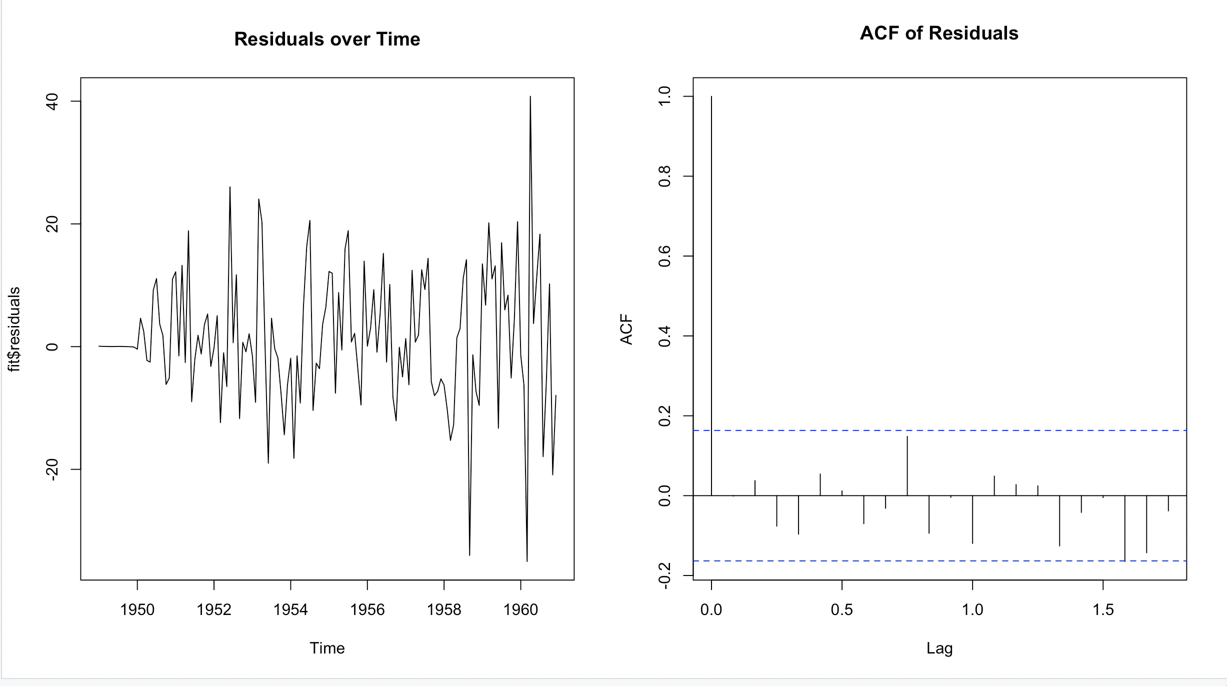
# Histogram of residuals
hist(fit$residuals, main="Histogram of Residuals")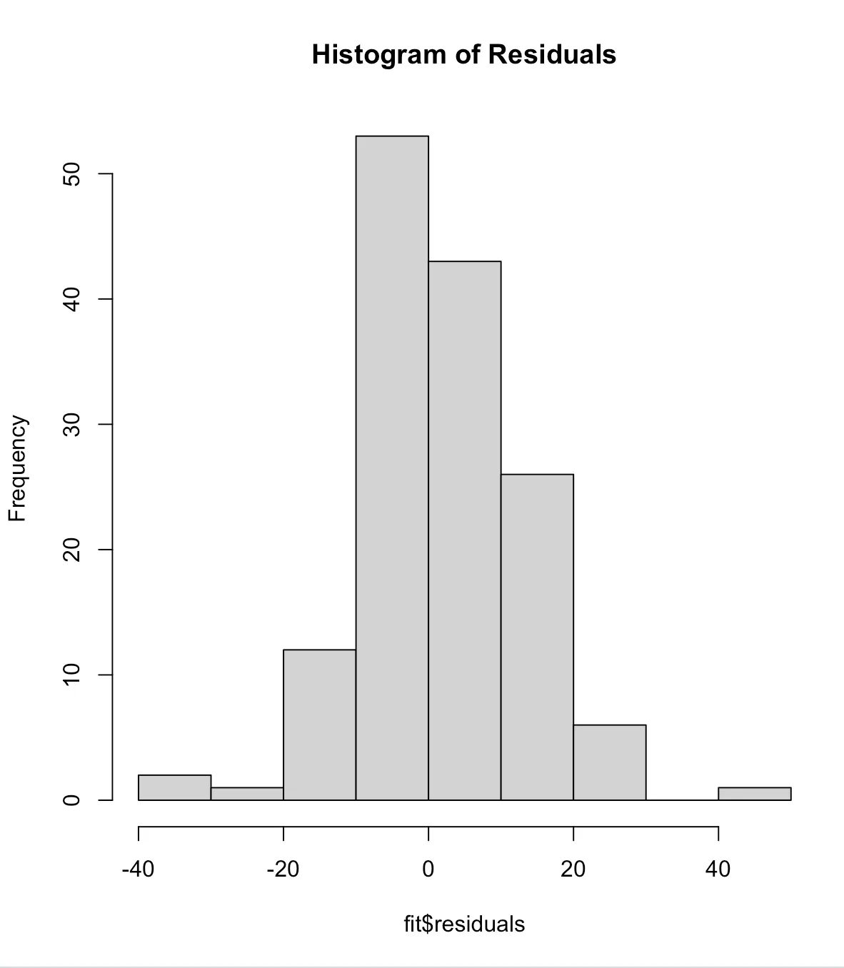
To understand the potential future values and their prediction intervals, we can visualize forecasts:
future <- forecast(fit, h=24)
plot(future)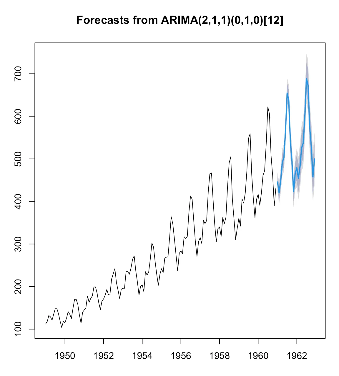
For datasets where multiple time series need to be compared. Here is a (more) generic example:
ts.plot(ts1, ts2, ts3, col=c("blue", "red", "green"))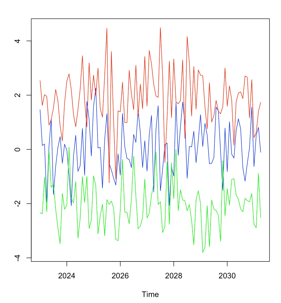
ggplot2For those who crave more customized visuals, the ggplot2 package in R is a treasure:
library(ggplot2)
autoplot(AirPassengers) +
  labs(title = "Monthly Airline Passengers Data",
      x = "Time", y = "Number of Passengers") +
  theme_minimal()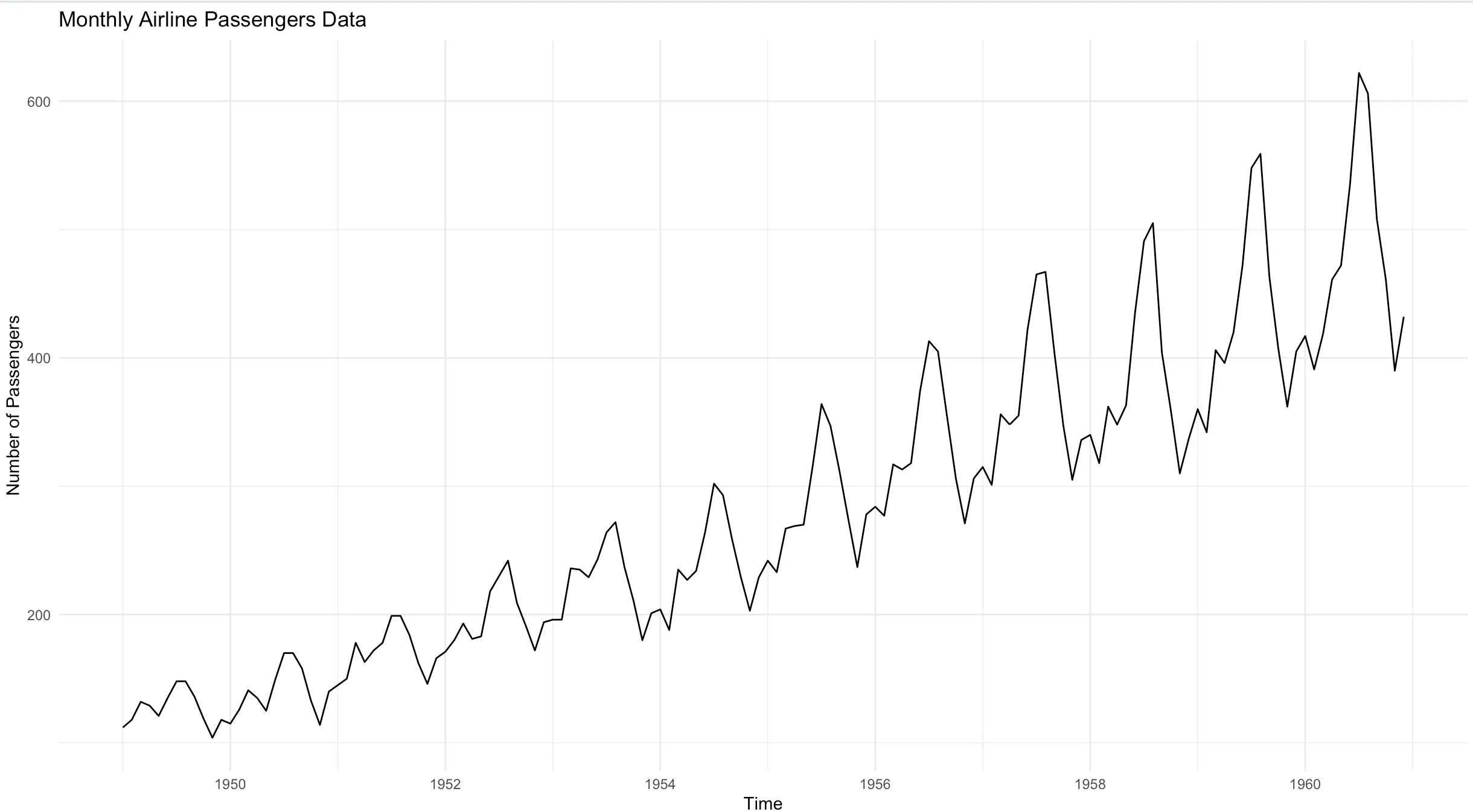
In conclusion, visualizing time series data in R can range from basic plots to more advanced, custom visuals. The tools and functions in R make it a versatile choice for time series analysis. As you dive deeper into this realm, always remember: the essence of visualization is clarity. Choose elements that make your data shine and tell its story effectively.